Follow Lilach
Web Accessibility: How to Ensure Your Website is Accessible to Every Visitor
You want every visitor to navigate your website effectively, find the right pages, and even buy your product. Right? Yes, of course.
But is your website accessible to every visitor to your website? Including disabled people?
According to the World Health Organization (WHO), there are over 1 billion disabled people in the world.
Undoubtedly, a huge number of these people are your potential customers. That’s why web accessibility is a necessity rather than a luxury. You can either hire a professional to fix the accessibility issues of your website or you can use an automated solution like web overlays.
When you’re trying to implement web accessibility, you need to consider various types of disabilities including:
- Visual
- Auditory
- Physical
- Cognitive
- Neurological
- Speech
Whatever the type of disability, your visitor should be able to access your website content and take action.
But before we go into how to improve your website’s web accessibility, why should you ensure it?
Why ensure website accessibility?
There are many potential benefits of web accessibility. In a nutshell, here are two to keep in mind:
To increase conversions
Whether your visitor is at the top or bottom of the sales funnel, your ultimate aim is to convert them to customers. After all, you’re running a business.
However, if your website is inaccessible, disabled visitors will leave before they convert. In such a case, you’ve lost conversions and money.
To avoid legal troubles
Losing a $500 sale may be painful. But what if, on top of that, the visitor sues you? Since many countries have laws that make web accessibility compulsory, inaccessible websites are open to litigation.
In 1999, Bruce Maguire sued the Sydney Organizing Committee for the Olympic Games because he couldn’t purchase a ticket through his screen-reading software. As a result, Maguire got $20,000 in compensation.
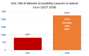
Today, there are even more litigations against inaccessible websites. For instance, 2,258 businesses got sued in 2018 because of inaccessible websites. This is up from 814 in 2017.
From hiring attorneys to paying compensations, litigations can be expensive. You want to avoid it. And only ensuring website accessibility will keep you safe from those issues.
Having said these, here are 6 ways to improve your website’s accessibility.
1. Add alt text to images
Visuals play an important role in web content today. About 15 years ago, it was common to find pages that are text only.
However, with greater capabilities, visuals are common and vital to readers. But what of people who can’t see images?
These are people who have visual impairments. But beyond that, it can also be people who live in places with low internet bandwidth.
Visitors in these categories need alt texts to understand what your image is all about. By having alt texts, visually impaired visitors will understand your images through screen readers.
Likewise, people with low bandwidth can see the text in place of the image. Another vital benefit is that search engine bots will understand your images and rank them better for relevant keywords.
If you use WordPress, it’s easy to add your alt text in the post editor. Here’s an example from a WordPress post:
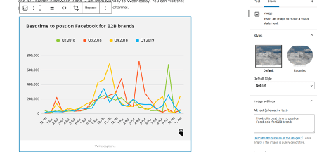
Also, if you have a plugin like Yoast SEO, it will alert you of images without alt texts.
2. Use descriptive anchor texts for links
Since links help to interconnect the web, they’re an essential aspect of the web experience. Whether you’re linking to an internal or external page, the anchor text will tell your reader what the linked page is all about.
Therefore, it’s better to replace the “click here” anchor texts on your website with why they should “click here.”
Here are descriptive anchor texts on one of my blog pages:

By using descriptive anchor texts, visitors using screen readers will understand the type of information they can get on the linked page. Even for visitors without visual challenges, this represents a better user experience.
Furthermore, search engine bots can follow links more effectively and understand the type of information on the linked pages.
3. Use a clear and consistent navigation structure
Navigating some websites can be a hassle, even with good sight. However, for a blind person who depends on a screen reader to browse your page, this can be a problem.
One important place to check is the content order. Is the order clear to someone using a screen reader?
If not, you need to contact your website developer to make adjustments to your website’s HTML. Here’s an example of a clear navigation structure:
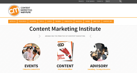
With this structure, it’s easy for screen readers to find content on Content Marketing Institute’s website.
Another vital part of your navigation structure is your headers. For your blog posts and other content pages, headers help people understand your page hierarchy.
For example, header 1 (H1) should be the page title and shouldn’t appear more than once. Other subheadings like H2, H3, H4, and more can appear later on the page accordingly.
4. Allow site navigation through a keyboard
When motor-impaired visitors land on your page, they should be able to use your website without their mouse. With keys such as tabs, arrows, and others, visitors should find it easy to navigate between links and other essential elements on your page.
This form of accessibility is easy to test. All you have to do is visit your website and try to navigate it with your keyboard.
If you’re unable to navigate effectively, then you need to make changes to your website or contact your web developer.
5. Create content and media with the color-blind in mind
The reality is that some people have difficulties viewing colors on your website. To make your website accessible, you need to maintain the right contrasts.
First, you should consider your website background and the text colors. Do you have enough contrast to make reading easy for a visitor who’s color blind? You can use a tool such as WebAIM to test color combinations on your page.
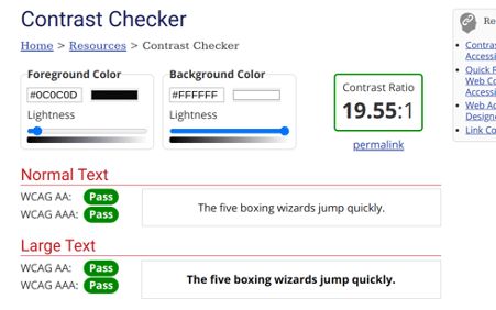
Second, you have to consider contrasts for your images. For instance, some images and charts use red and green colors to indicate downtrend and uptrend, respectively.
A popular example is the candlestick bars for FOREX traders. Colorblind people can have difficulties viewing these charts.
One easy way to check the contrasts on your page is to use a Google Chrome extension that allows you to view your page like the color blind.
7. Use an automatic web accessibility tool
Instead of paying your developers or web accessibility experts from time to time to ensure accessibility, you can use an automatic accessibility tool that will monitor your website. As a result, your website will always be accessible.
An example of such a tool is accessiBe. This tool uses artificial intelligence (AI) to regularly scan your website to ensure its ADA and WCAG compliance.
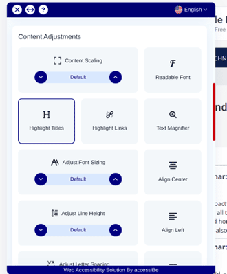
With the accessibility icon on your website, any visitor will be able to adjust content, activate virtual keyboards, stop animations, and more. As a result, a visitor will be able to customize your web page to their needs.
Here’s an example where I activate the “Monochrome” option on Small Business Trends’ website:
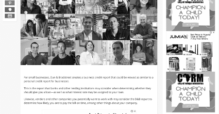
By using accessibility tools, you can save the cost of hiring a web developer or ADA compliance companies.
Conclusion
Today, web accessibility is a huge issue you can’t afford to ignore. First, making your website accessible means more visitors can use your website effectively and become customers.
Second, you’re at no risk of having an expensive legal battle on your hands. Most importantly, you’ll improve the user experience for every visitor.
Therefore, if your website is inaccessible, you need to make the right changes urgently.
Is your website accessible? What’s your view on website accessibility? Tell me in the comments!

Follow Lilach


