Follow Lilach
5 Tips for Designing Engaging Niche Landing Pages That Convert
If there’s a single rule to digital marketing, it’s that you never link to a homepage. Unless, of course, you’re after a high bounce rate and low ROI. Who wouldn’t want that, right?
The thing is, directing visitors to your website, then leaving them to their own devices isn’t enough. No matter how minimalistic and straightforward your homepage is, it’s highly unlikely to be optimized to convert right away. And when directing off-site traffic, those conversions are what you’re after.
When you’re running a marketing campaign (paid or not), you want to send website visitors to dedicated landing pages. These are specially built and designed to drive one single action – conversion. They prevent distractions, present visitors with highly-focused CTAs, and improve your chances of capturing leads or making a sale.
Of course, it’s important to remember that all of this can be slightly more challenging when running a niche business. But is it impossible? Absolutely not.
What is a niche business, anyways?

Here’s the deal. Capitalism and globalization have made it incredibly easy for those with large starting capitals to make money. All you need is a relatively good product and a well-developed business strategy, and you can do almost anything. But while this is excellent news for those with deep pockets, it’s not so good for small businesses.
Increased competition and a limited reach typically require companies to engage in price wars. Those whose operations can sustain high-volume sales will go for quantity, making their profits by earning a small portion on many (many, many) sales. But small and local businesses often can’t compete, which means that they either need to shift strategies or go out of business.
Here’s where serving a niche market comes in.
Catering to smaller audiences, through highly-specialized products and services, companies who serve niche markets have the opportunity to distinguish themselves. They face a lower amount of competition (which automatically eliminates price wars). They can develop expertise and provide higher quality products. And, finally, they have a better way to build their brand and establish themselves as an authority.
Popular niche markets in 2020 include:
- Health
- Fitness
- Beauty
- Pets
- Dating
- Personal growth
- Investment
- Gadgets
Of course, these are just examples of niches that have strong followings. In truth, businesses can identify and cater to diverse audience segments in almost any market. Just think of Tesla, the (forever underdog) electric car manufacturer who is now one of the most successful car manufacturers in the world. As experience has shown time and again, anyone can find their niche – regardless of whether they’re offering products or services.
The more specific a niche is, the easier it is to stand out without having to spend high amounts of money on PPC campaigns and marketing. In fact, for many small businesses that focus on such markets holds the key to growth.
How web design serves niche companies
There’s no question about how beneficial good web design can be for conversions. There are many rules regarding “best practices,” and they really do show results. But when catering to a highly specific segment of the market, your needs won’t be the same as everyone else’s.
This is where an experienced web designer comes in. When they understand your pain points, as well as those of your audience, they can create focused and fully optimized pages that convert.
On the whole, a well-designed niche website will do the same things a regular one does. Firstly, it will be fully optimized for organic rankings. Secondly, it will be highly engaging, with well-placed CTAs that convert. And thirdly, it will support content marketing strategies to minimize marketing spend. These same principles apply to landing pages.
And no, a great design without a high-quality product and exceptional user experience won’t fulfill your goals. But as long as you do your part of the job well, it can definitely help, both with reach and with sales.
DESIGN TIPS FOR NICHE LANDING PAGES THAT CONVERT
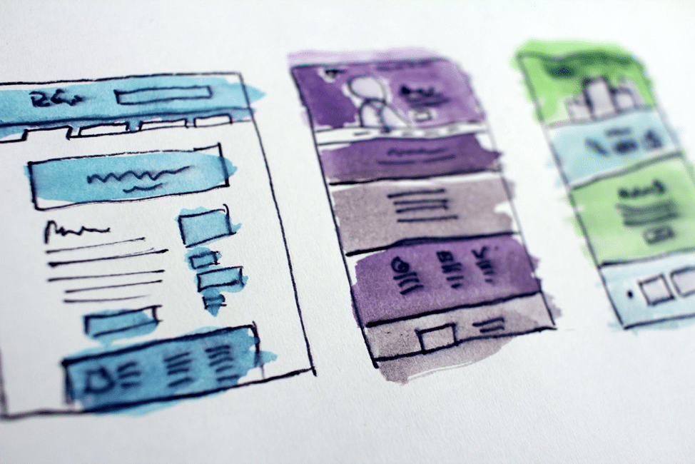
So, if you’re prepared to take the next step in growing your business, it’s not a bad idea to analyze and improve the landing pages you use. Of course, you don’t have to follow all the tips below. But recognizing the strategies that could help your company, and applying them, is going to make a significant difference in your metrics.
1. Define your goal
While there are numerous actions a visitor can make on your homepage, a landing page is going to be considerably more limited. But that’s a good thing.
You create landing pages with a highly specific purpose in mind. And by paring user actions down, you’re optimizing them for conversions. There are different purposes you can optimize your niche landing pages for, but the two most common include lead generation and click-through (sales).
What this means is that you need to remove all irrelevant information, and your CTA buttons need to be highly convincing.
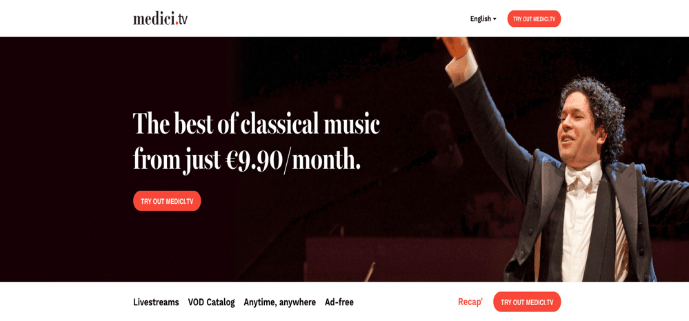
For example, if your goal is to sell a service, you may want to follow the example of Medici.tv, a VOD subscription service similar to Netflix, that focuses on classical music and performing arts.
The company’s subscription landing page includes all the details you’d usually get from a SaaS. But what it does particularly well is that it utilizes simple yet clear CTA buttons that invite website visitors to try the service out. The same button is repeated multiple times on the page, making it easy for anyone interested to sign up for the affordable annual subscription.
As you can see, there’s no free trial advertised (although there is a limited-time discount offered). But considering that the website caters to audiences who would gladly shell out $300 for a single live performance, it becomes obvious that price is not a problem. Instead, the intention is to get them to try the service out through placing well-designed CTA buttons in strategic places.
2. Point out the benefits you offer
If your niche landing page design focuses clearly on a single action you want your web visitors to take, it’s time to consider how you’re going to sell your product.
One key principle of doing business is to always put yourself in your customer’s shoes. As you’re catering to a niche market, your job will be made slightly easier by having a well-defined audience. Not only do you know their exact needs, but even more, you have the solution to their problems. Thus, your task will be to find good ways of describing your services.
The consensus for engaging copy is that it needs to be short, simple, and broken up into easy-to-consume bits. Short paragraphs and bullet points convert particularly well, as do images. Which of these you opt to go with on your landing pages will depend on what you can do.
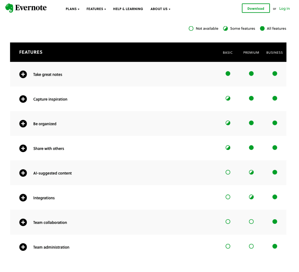
On the one hand, you can employ a completely minimalistic design, such as in the case of Evernote. On their landing page, Premium and Business plans are distinguished through a basic check-list. Each of the points can be expanded, allowing potential customers to go into more detail regarding each feature of the software.
On the other hand, some companies need more approachable ways to describe their offer. For example, Ultimate Meal Plans makes use of a “What’s in it for you” section where the benefits are shown through four illustrated sections. These make for an excellent strategy as they show off more than just technical details. This way, they’re more approachable to a wider audience looking for services in the food and fitness niche.

3. Be clear about your mission
A mission statement is a big part of any business plan. But what you may not realize is that it isn’t just a guiding principle on how you’ll organize your business. Even more than that, it’s a signal to potential customers about what they can expect from you. And what better place to show off your values than your landing pages?
Common beliefs connect. And if your audience agrees with what you stand for, they’ll be more likely to want to support you. The reason behind this is simple. By calling attention to the issues you want to solve (be they global warming or better quality opera recordings for anyone interested), you are appealing to your customers’ emotions.
The more they agree with you regarding the value of your cause, and the more vocal you are about contributing to that cause, the higher the chances that they’ll want to support you and buy from you.
Think about TV commercials. They’ll often feature wholesome families, say gathered around the dinner table, or participating in fun activities together. And it’s not because their products are necessarily related to family activities. Instead, these ads are constructed to evoke certain types of emotions, which will, then, drive viewers to make a purchase.
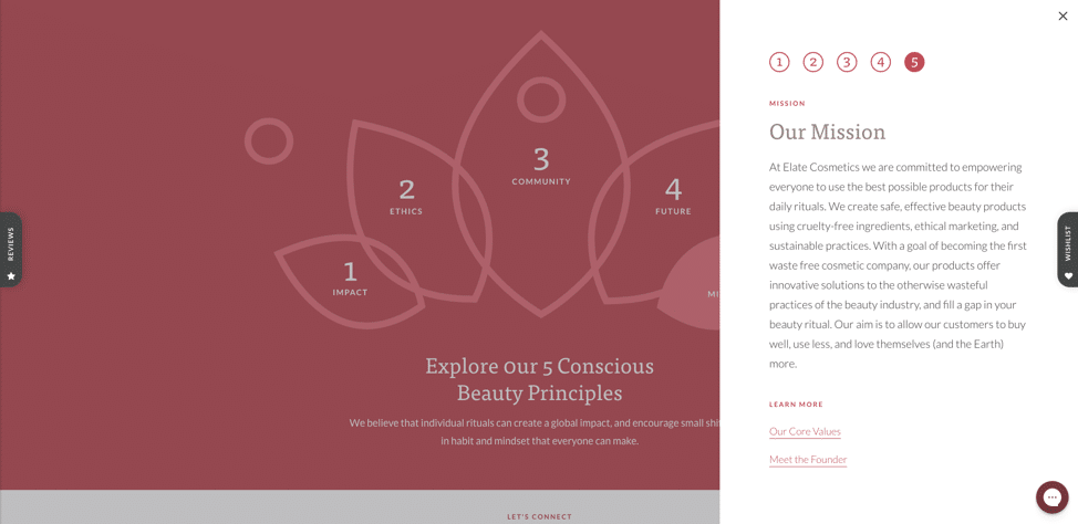
In a way, you can do the same thing on your landing pages. Take, for example, the zero-waste make up brand Elate. They operate in a very well-defined niche of the beauty industry, but they differentiate themselves from the competition by proudly presenting their mission statement. They stand for sustainability, inclusivity, and ethical marketing, inviting like-minded individuals to support them in their attempts to contribute to positive global changes.
So, despite taking a slightly different route to emotional marketing, what they’re ultimately doing is still rooted in the mission to make their customers feel valued, accepted, and relevant to how their environments are shaped.
4. Introduce interactive elements
One way of optimizing your landing pages to drive conversions is to include interactive elements. While these stray from the minimalistic rules that are usually applied in e-commerce, they are highly engaging and could thus help you achieve your goals.
The thing about interactive elements is that they don’t necessarily have to be ultra-complicated. Vegan supplements company Future Kind chose to engage page visitors with a quiz. Its aim is to allow people to find out whether they’re at risk of a vitamin deficiency.
Ultimately, this is a brilliant marketing strategy, as it even offers product solutions to those potential customers who don’t yet have a clearly defined pain point. By taking the quiz, website visitors are automatically moved further down the sales channel, minimizing the time between the awareness and purchase phases.

Of course, if you’ve got a world-class designer on hand, you can go much further with the interactive elements on your landing pages.
One of the best examples of how far you can take things comes from the automotive industry. For example, the Toyota Yaris landing page lets visitors quickly view different colored versions of the car, just by clicking on their desired swatch. Smartphone manufacturers do a similar thing, as well as other companies in the tech industry.
5. Use A/B testing methods
Once you’ve got the basics of engaging landing pages down (clearly defined CTAs, well-stated benefits, emotional and interactive elements), it’s time to check which of these do the job for you.
Luckily, it’s quite easy to conduct A/B testing, as most advertising platforms will let you test different versions of landing pages. You can do it through most email marketing clients, social media campaigns, and Google Adwords. And if you know what metrics to pay attention to, you’ll find it’s quite easy to perfect your design and drive conversions with evidence-based data.
If you’re new to A/B testing (otherwise called split testing), you’ll need to create two versions of your landing page. Some of the best design elements to test include:
- CTA button placement
- Color schemes
- Copy versions
- Image placement
- Video content
- Audio elements
- Types of social proof
- Product/service descriptions, etc.
One word of advice for A/B testing, however, is that if you’re planning on doing a paid marketing campaign, make sure you’re monitoring data, and recording it for future reference. Depending on the duration of the campaign, you may even want to start making changes to your design while it is still ongoing. This way, you’ll prevent unnecessary spending on ads that don’t work and will be taking a more proactive approach to the success of your business.
Final thoughts
Knowing that we live in a fast-paced world, it’s important to consider the amount of time website visitors are willing to spend on a landing page. With niche markets, you have the advantage of customers coming to you, instead of you having to chase after them. But once they land on your website, it’s up to the visual elements to drive conversions.
In just a few seconds, they need to communicate why your company is the right choice, what unique benefits you offer, what pain points you can solve for potential customers, and how you are going to do it. As you’re already aware, a chunk of text isn’t going to do it well, so you’re going to have to do this through highly engaging design. But the great news is, engaging design that converts isn’t that hard to pull off.
Just by following these five tips, you’ll have made an excellent start. Combine these practices with mobile and SEO optimization, a good content marketing strategy, and an involved social media strategy, and you’ve got yourself a recipe for success.

Follow Lilach
