Follow Lilach
How to create a Landing Page that really converts
In this post we are going to learn how to create a landing page that really delivers results for your business. Website owners frequently feel that they need more traffic to their website. The truth is that while more traffic is always nice, they probably aren’t making the best possible use of the traffic they already have. Traffic problems aren’t difficult to solve, you can just increase your PPC or Facebook Ads budget and drive more traffic, but what most websites have is a conversion rate problem.
For the vast majority of websites around today only a tiny percentage of their visitors actually end up buying from them. For many websites the conversion rate may be as low as 2-3%. Since only the visitors who convert actually produce revenue for you this means that more than 97% of the traffic you drive to your website is being wasted and produces no revenue at all.
Why is that? Why don’t more of your website visitors complete the purchase process, and what can be done to improve the situation?
 Most websites experience low conversion rates because they don’t give visitors what they want. A company may put a lot of time and effort into creating adverts that generate clicks, but then they drive those who click on the adverts to generic, corporate landing pages that don’t offer them what the advert promised. If someone clicks on an advert offering a 20% sale on an item then when they click on that advert they should be taken to a webpage that clearly says 20% sale. Taking them to a general webpage, and making them hunt for your sale items is going to kill your conversion rate.
This situation often occurs because companies do their marketing in reverse. They put all their effort into creating a great advert and then try to work out which page on their website they should link it to. If you want to see conversion rates rise then you need to turn this approach on it’s head. Start your marketing by thinking about the landing page. Spend your time optimising it, and then create an advert specifically designed to lead people to that page.
[clickToTweet tweet=”How to create a Landing Page that really #converts via @lilachbullock” quote=”How to create a Landing Page that really #converts via @lilachbullock”]
What makes a great landing page?
Too many landing pages are shaped by people who are already deeply involved with their organisation and don’t know how to approach sales from the customers perspective. A good landing page is one that meets with the customers’ expectations and desires.
So what are the key elements that must be included if you want your landing page to get results?
Logo – A logo or a graphic is an effective way to quickly identify who you are. Customers need to feel comfortable with you. They need to know that you are a professional operation, and a professional logo is a fast way of conveying that impression to them.
Headline – Let people know what they can expect on that page. To reach your landing page your visitors will have clicked on an advert or a search result that is in some way related to something they are searching for. Now you should use the landing page headline to connect the page to the advert. The headline on the page is probably going to be one of the first things that grabs their attention so make sure that they quickly see a link between the advert and the landing page so that they know they are in the right place.
Use the rest of the page copy to set out clearly exactly what you are offering. Make sure your offer is clearly visible and appears near the top of your copy then expand your offer and explain exactly what your customers will get when they buy your product.
 Service or product demonstration – A demonstration video showing exactly what you are offering can make clear to your readers how your product can really help them. Emphasise the benefits of your product to your reader and show them how it can change their life for the better.
When all of your information has been presented it is time to call your reader to take action and to actually make their purchase. Your Call-To-Action may be a link they need to click on, a button for them to press or a form to fill in. Whatever it is make it visible and show the reader clearly what you want them to do.
[clickToTweet tweet=”How to create a Landing Page that really #converts via @lilachbullock” quote=”How to create a Landing Page that really #converts via @lilachbullock”]
Build their confidence
Persuading your reader to take action isn’t always easy. There can be many reasons that they are reluctant to take the plunge and buy. To make a conversion more likely you have to engage in confidence building measures.
These confidence building measures may include testimonials from satisfied customers explaining how they have benefited from the product, and examples from other users showing how the product has benefited them. You could also consider offering a money back guarantee or a no questions asked exchange policy. You should do everything you can to make a purchase look as risk-free as possible.
If you can’t offer a money-back guarantee you should think about boosting your visitors confidence in other ways. Anything you can do to reassure them that you are a legitimate, professional business will help to make them feel happier about buying from you. It could be as simple as clearly listing your contact details so that they know you are happy to answer their questions, and can be reached easily if they have any concerns.
Sometimes, it doesn’t matter how much information you make available to your readers on your landing page there is always going to be someone with a question you can’t answer in the space available. In that case adding links to where further information is available will help to reassure your visitors.
Finally, don’t forget to have the standard template elements that almost all websites include. A copyright notice, publication date etc, may not seem important but they all add to the picture of your business as being professional and trustworthy.
Once you have added all of these elements to your landing page it’s time to optimise them to really start improving your conversion rate.
[clickToTweet tweet=”How to create a Landing Page that really #converts via @lilachbullock” quote=”How to create a Landing Page that really #converts via @lilachbullock”]
Optimising your landing page
 A visitor arriving on your landing page is going to have certain expectations. They may not know much about your business but there is something they want and they think you can provide it for them They have a goal and they think you can help them achieve it.
Your visitors believe you can help them because your business showed up when they entered a search query into Google so they should be ready to buy whatever you are offering. If they don’t convert into sales is because you didn’t communicate clearly enough how your business can benefit them.
To convert your website traffic into buyers there are three key elements that you must get across to all your visitors.
Relevance – You must effectively explain to your audience that your product has relevance to them. You can’t simply make general statements; you must provide an explanation of specific benefits you can offer each reader. Visitors come to your website looking for specific answers and if your copy is too general then you aren’t going to establish enough of a connection to them and you will be unable to convert them into sales. The more specific you can be about what you are offering the more successful you will be at converting visitors into sales. If you sell many brands of a particular product you should try to work each of those brands into your copy somewhere on the page. Don’t just talk about mobile phones, but refer to the brands by name. Samsung, HTC, Sony, Apple etc. Your visitors will consider your copy more relevant to them if they see the brand they want listed on your site and then they are more likely to stay on your site and keep looking for the product they need.
Value – Your readers must understand that what you are offering will be valuable to them. This is where being really specific helps. Tell your audience why this product or service is important to them specifically. Give them examples that show the value to people just like them. Don’t try to make this too complicated, keep the value as simple as possible, and ensure you list the benefits clearly. It may help to use simple bullet points that set out exactly what customers can expect from your product.
Call-to-Action. You must impress upon your audience the need to take action NOW. This must be about a lot more than adding a button or a form to the page. You must give your audience a reason to want to press that button or fill in that form.
Work through your web page and identify where each CTAs occurs. Now concentrate on closing any gaps that might prevent your visitors feeling confident enough to take action. Help your visitors follow the information scent from advert through to conversion. The scent acts like a lure to pull visitors along from one link to another.
[clickToTweet tweet=”How to create a Landing Page that really #converts via @lilachbullock” quote=”How to create a Landing Page that really #converts via @lilachbullock”]
That is really all there is to creating a great landing page. These principles have been known for many years and they still work. Google calls this producing “relevant and original content.” You take your customers directly to the page that is relevant to the advertisement they clicked on, and when they get there you tell them everything that they need to know to convert. Most of your visitors are keen to buy from you. If they don’t click the purchase button it is often because you have failed to give them sufficient reason to make the purchase. To be successful you must clearly communicate the nature of your business, and explain to those reading why they need to buy from you. You need to give people value, and they need to understand the value in what you are giving them so that they will feel confident enough to take action and buy.
It is often the confidence building measures that are lacking on what would otherwise be highly successful landing pages.
Confidence building is a vital part of any conversion strategy. Give people the confidence to take action. A great way to make your offer relevant to people is to use testimonials. Real life examples of people in a similar situation to your audience explaining how your company has improved their lives can be a very powerful tool to persuade readers that your business is right for them.
Your readers understand that there is minimal risk to themselves in acting, and that they will benefit in some way by taking this action. Somewhere on your landing page you must answer all their questions and calm all of their anxieties. The job of the content writer is to deal with everything that will stop them clicking that buy button.
[clickToTweet tweet=”How to create a Landing Page that really #converts via @lilachbullock” quote=”How to create a Landing Page that really #converts via @lilachbullock”]
Keep testing your page
 Even when you have done all that you think you can to create a landing page that converts well, there is always more to be done. It is vital that you test your page to see how it can be improved.
How exactly should you go about testing? You must have a plan. It’s no good just testing elements of your page randomly, you might hit on a great improvement, but it’s far more likely that you will actually make the page worse. Making lots of changes at once is also a bad idea. If you see a change in your conversion rate you will have no idea which one of your changes made the difference, and whether you might have achieved a higher conversion rate if you had left some elements of the page unaltered.
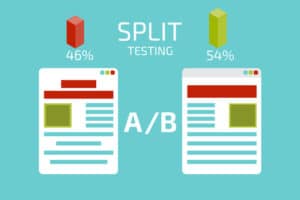
The most effective way to test intelligently is to create A and B versions of your landing page and see which one has the best results over a fixed period of time. When you discover which version is the most effective version then take that page and change something else on the page and see how that affects your results. Keep testing and refining your page as there is always more to be done. Test everything you do and find out what works best for your audience. You should have a specific testing plan in place for each of your customer segments. Try setting up different offers to see which appeals best to each of them. Test and refine your page continually and discover the most appropriate design for each part of your audience.
Conclusion
In this post we have looked at Conversion optimisation for a landing page but that can only be one strand of your strategy. Conversion optimisation must be about everything that you do. You also need to look at optimising your personalised sales emails. Your company autoresponders, and every point of contact between your business and the customer. The message you present to each of your potential buyers is going to be different. Each visitor needs to know that you understand them, that your product can benefit them personally, and that your business is the right one for them to buy from.
What do you think of these conversion optimisation principles? Is there something else that you have found to be very effective? What did I miss out? Let me know in the comments, and if you found it helpful don’t forget to share it with others.

Follow Lilach
