Follow Lilach
How to Generate More Qualified Leads By Adjusting Your Homepage Messaging
Do you want to generate more leads?
Do you wish to turn the tables for your business?
Then, you are in the right place because we are going to tell you how you can boost your lead generation by simply adjusting your homepage.
For every business, generating leads is very important. The more potential customers you get, the better it is for your business.
A business website acts as the first point of contact between a business and its customers. This is more important for online businesses as they get most of their leads through their website.
If your leads come through your homepage, then you need to make sure that you have an excellent homepage design.
In other words, everything about your homepage should be on point. It should have all the features to attract and retain customers.
It can sound unbelievable but even with just a few right adjustments on your homepage, you can boost your lead generation by 50%.
In this article, we will look into the case study of Tandberg, a teleconferencing company that increased its lead generation by 50% in just one month.
This case study will shed some light on the important points that we want to highlight.
How Tandberg Increased Its Lead Generation By 50%
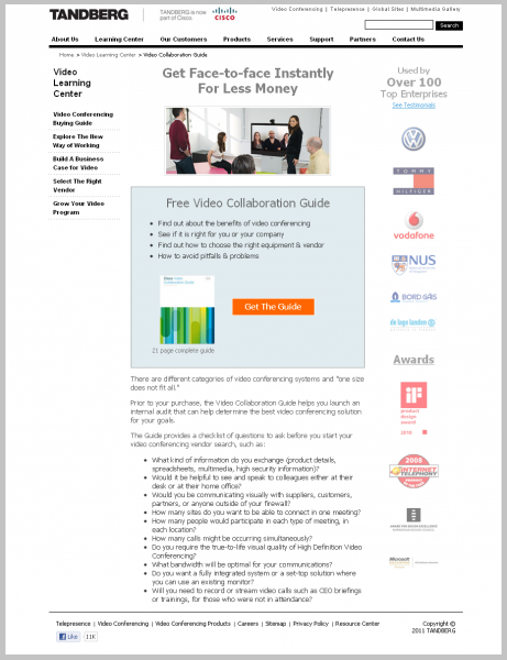
Now we are going to discuss the case study of Tandberg that proved to be the most successful.
If you run an online business and want to boost our lead generation in just a month, then you should take a lesson or two from the case study below.
This discussion will help a lot of companies improve their:
- Sales
- Lead generation,
- Online engagement
Without wasting much time, let’s get into the details.
Tandberg is a leading name in the teleconferencing industry. As a leading business house, they had a well-established online presence.
They had their digital marketing campaigns on point. However, the company still needed to make some improvements in getting end-users to take the initiative to engage with the company online.
According to a recent acquisition by Cisco, the core demographics and audience base of the company have shifted slightly.
Their website was falling back on performance as it couldn’t keep up with the latest messaging requirements.
This resulted in lower lead generation and poor conversion rates. Seeing the falling condition of the company, Tandberg was desperate to get help. They needed an effective strategy to improve their condition.
They took help from SiteTuners to formulate a strategy to increase online engagement, get more leads and boost sales. SiteTuners came up with a one-two punch to help the company.
SiteTuner started by analyzing the situation and realized that a major percentage of traffic was entering the website through the homepage.
This led them to make a strong call-to-action button for the homepage of the company.
They incorporated a call-to-action button that convinced the visitors to watch a Video Buying Guide with tips on using video-conferencing platforms. Incorporating the call-to-action button was the first step taken by SiteTuners.
In the second step, they focused on building an engaging landing page that would appeal to the customers.
The landing page was designed to attract a wide range of audiences with technical understanding, native languages, and industries.
The landing page, a lead generation form, was needed to provide the benefits of the video buying guide while building a sense of trust at the same time. This was needed so that customers would feel more comfortable submitting the form.
Before SiteTuners came into the scene, Tandberg was receiving an average of 15,000 traffic a day.
As far as conversion rate was concerned only 200 to 300 people were converting per week.
Tandberg received most of its traffic through the internal links on its site, organic SEO and links from Cisco.
SiteTuners took to the task of creating multiple landing pages design for the company.
This included both one-step and two-step solutions. Each of these had a wide range of choices.
They used each of these landing page designs over several months and even conducted an A/B split test against the original landing page to find out the most effective design of all.
After the test was completed, they knew the winner and implemented it permanently on their website.
The steps taken by SiteTuners proved to be effective for Tandberg. The results were showing as they started getting more leads.
- The CTA incorporated in their site was the best performing CTA ever.
- The new creative design implemented on the site resulted in a 40% to 50% increase in lead generation. All this happened over just 30 days.
The landing page was also optimized which had given the company the edge to take the first step to contact the audience.
Tandberg needed a full-proof strategy to increase their lead generation, boost their sales and stimulate their online engagement.
This was provided to them by SiteTuners. All they had to do is make a few changes on the homepage and include a strong call-to-action button which was the actual game changer.
Rundown
Your website is the face of your business. Unless you have a well-designed and efficient website, you cannot establish your business online.
To get more leads and increase your sales, you need to promote your business through email and on various online platforms like Facebook, LinkedIn, etc. as more people will get to know about your business, you will get more traffic on your website.
If you want to retain your visitors and turn them into customers, you will have to make sure that your homepage is on point.
You need to take the initiative to engage with your customers. This is where the need for a call-to-action button comes into the picture. This will prompt the users what they have to do next on your website.
The call-to-action is one of the most important elements on a webpage. It acts as a signpost and lets the visitors know what to do next.
If your site lacks a strong CTA like Tandberg, the user will not know the steps to sign up for a newsletter or make a purchase. As a result, you will end up losing customers.
With the help of a call-to-action feature, you can prompt potential customers to take the next step and help them to move down the sales funnel.
You can have more than one call-to-action on your page if you have multiple actions for the users.
At the same time, you also need to make sure that you place the call-to-action correctly so that it is easily visible to your customers.
A call-to-action is preferably placed at the bottom of the page. Unless it is visible to your audience, they won’t be able to take the required step.
The next important thing is the landing page of your website. Since it is the entry point to your website, you need to make sure that it has an appealing design.
Landing pages funnel customers from a link within a source. For example from a social media post, direct mail, emails or pay-per-click ads.
Landing pages help in lead generation by the enticing interested audience to fill out a form.
That being said, now let’s discuss some important tips that can help you get more leads.
5 Tips To Generate More Leads For A Business
As a business owner, your priority is to generate as many leads as you can. The more leads you get, the better it is for your business.
From the above discussion, we learned how having the perfect landing page and call-to-action can help you boost your lead generation. If you too want to get more leads within a short time like Tandberg, then you need to follow the tips given below.
1. Use a strong call-to-action
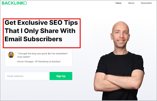
Like we said, call to action is the most important thing on your landing page as it prompts the customers to take the next step.
CTA gives you the chance to motivate your visitors to take steps to convert into real customers. Not having a CTA on your site is the biggest mistake you can make.
CTAs and marketing funnels go side by side. They help the user to move to the next step.
Whether you want your user to sign-up for your service or visit your blog, or subscribe to your email list, you need to provoke your customers to take this action.
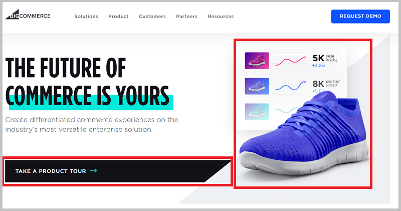
This can be done with a well-placed CTA on your site.
Here’s an example of what I’m talking about:
2. The clean and organized design
The overall design of your page has a huge impact on your visitors. You need to provide your visitors with a user-friendly landing page so that they can easily convert into real customers.
No one has the time to sit back and understand how the landing page works. If users find it hard to deal with navigating, they will simply leave your site.
As a result, you will end up losing customers. This is why you should implement a clean and organized design for your landing page.
You can take the help of web designing services as they can tell what’s best for your business. With their help, you can design the perfect landing page for your business.
Let’s not forget that the landing page is an important marketing tool. It helps in converting your visitor.
Below is a good example of a clean and organized design landing page.
3. Test the design
Before you implement the final landing page design, you should put it to test. It is advised you create more than one design and use them all, one after the other.
This will help you find out which design works best for you. Once you know the best design, you can implement it permanently on your landing page.
Using the best landing page design can benefit your business in many ways. Most importantly, it will help you to convert your visitors and thus, increase your sales.
4. Use a responsive design
Another important thing is a responsive landing page. Around 90% of the consumers these days use their cell phones to surf the web.
In such a situation, you need to make sure that your site is accessible even from mobile phones. This is where the need for a responsive design comes into the scene.
Below is a good example.

Having a responsive landing page design means your site can be accessed from all devices including PC, laptops, mobile phones, tablets, etc. This will give you the chance to reach maximum consumers.
5. Optimize your landing page
Landing pages are the most important part of your online marketing campaigns. They are specially designed to generate sales and leads. A lot of money and resources are spent to drive traffic to these pages.
Landing pages are focused on conversions and thus, improving their performance you can get great results.
This is why optimizing your landing page is important. This will help you to get the highest possible conversion rate.
Along with that, it can also help you to lower your customer acquisition costs, maximize the value of your ad and get more customers.
For example, check out the below Fitness Singles’ optimize landing page.
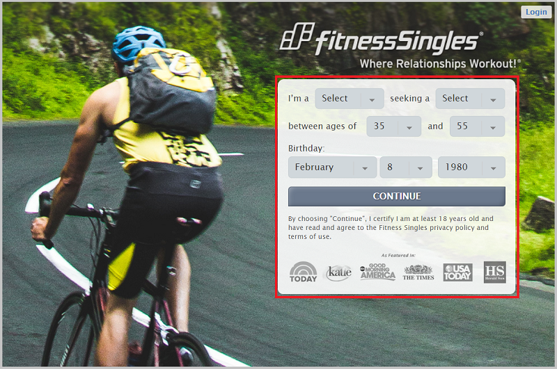
They use high-quality images in the background.
From the above discussion, we learn that improving your landing page and using a call to action can benefit your business in many ways.
To generate more leads and increase your sales, you need to make sure that you are offering something interesting to your customers.
You need to guide your customers to take the next step so that they make a purchase or sign-up for your service.
At the same time, you need to make sure that you place the call to action correctly.
Having an attractive landing page design can help you to retain your customers. If they find your landing page easy to navigate, they will naturally show interest in your website.
By just making a few changes on your landing page, it is possible to boost your leads in a short period. You can already see the proof in the Tandberg case study.
Over to You
If you found this article, then do let us know in the comments. If you want to boost your leads, then you must try the tips mentioned.
About the author:
Bill Acholla is a professional digital marketer who helps entrepreneurs build their business brand through content marketing. Visit his business blog at BillAcholla.com for more actionable marketing tips.

Follow Lilach
