Follow Lilach
How to design your website so it converts your traffic into buyers
Have you designed your website with conversions in mind? Optimising your website’s design can have a big influence on your overall conversion rate, as it can improve – or worsen – the customer experience. In this blog post, I will be showing you how to properly design your website in order to achieve a higher conversion rate.
When designing your website, you should always keep your customers in mind; after all, your website is there to help you sell and if your visitors aren’t having a good experience, they will likely abandon it. On the other hand, if their experience is great, it can generate more sales, as well as improve your relationship with them, as their trust in your business grows.
The conversion optimisation process
In order to design your website for conversions, you need to have a clear plan in mind before getting started:
- Who will be visiting your website – what are their buyer personas?
- What are the most important factors on each of the pages on your website?
- How can you make it easier for your visitors to take action on your website?
[clickToTweet tweet=”How to #design your website so it converts your #traffic into buyers via @lilachbullock ” quote=”How to #design your website so it converts your #traffic into buyers via @lilachbullock “]
A website designed with conversion optimisation in mind will be able to cater to all of the different personas who might visit it. Not everyone thinks the same, or acts the same – and your website should reflect that if you want to make more conversions. You can read more about the different buyer personas by checking out my blog post here.
Usually when designing a website, most will start by creating a simple wireframe, or the overall layout of each page. This is great for getting an idea of what your website will look like, but it doesn’t necessarily help when you’re also designing for conversions.
Rather than thinking about what each web page will look like when the website is finished, try to think more about how each page is going to be used. What journey will each of your visitors, and the different types of buyer personas, will have to take through your website?
By considering the website journey and the customer experience on your website, you will be able to determine what pages you will need to create and what each of them should contain.
The best way to create this kind of website framework, is to take each buyer persona separately and plan each one’s click by click experience on your website.
This way, the different pages on your website will be constructed specifically for a particular type of buyer – competitive, methodical, spontaneous and humanistic buyers. You will be able to add the type of content that each group is most likely to respond best to. For example, for methodical buyers, you should add as much relevant information as possible about your product or service, as well as detailed testimonials. For spontaneous buyers, focus on adding more eye-catching content such as videos or interactive content.
Some of the main things you should be considering at this stage are:
- Which persona is each page for?
- How did they get to this page and why are they here?
- Where are they going next?
- How will they get to the point of conversion? What stands in the way of their converting?
[clickToTweet tweet=”The #conversion optimisation process for website #design via @lilachbullock ” quote=”The #conversion optimisation process for website #design via @lilachbullock “]
Storyboarding: what messages do you want to share?
Before you start laying out the design of your website, it’s best to think about the messages you want to share with your visitors. Knowing what content you want to include will then allow you to better design your website with conversion optimisation in mind.
Think about what story you want to tell on your website. This way, you will be able to create the basic internal linking structure for your website with the customer journey in mind. At this stage, you can also start thinking about what anchor text you want to include and where your different hyperlinks will go. This is also great for search engines, as it will help your website rank higher in queries. Not only that, but you will also know exactly what pages you are going to need and you will know exactly what the internal linking structure will be.
Now that you’ve considered and planned all of the structural aspects of your website’s design, you can start looking into other design factors, such as what colours to use, what types of images and videos and so on. There’s no denying the importance of such factors, but all too often, websites will focus more on these aspects, to the detriment of their structure and navigation, which can have a negative effect on their conversion rates.
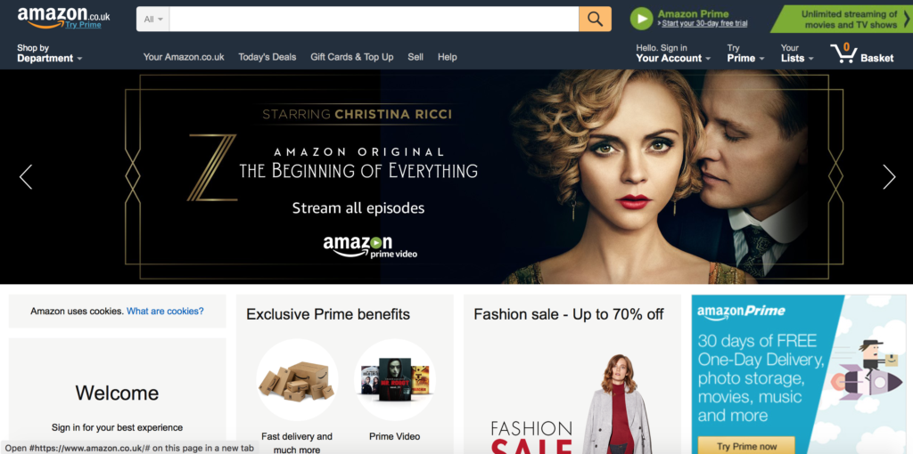
A website might look great at first glance, but if it’s difficult or confusing to use by your visitors, they will likely abandon it. Just look at Amazon; they don’t have the most beautiful website by any means, in fact it can be quite simplistic, but the fact that it is so easy to use has certainly helped it become one of the undisputed giants in online shopping.
Prioritising your best content
Another reason why it’s best to start by creating your content, is that by creating the design first, or by using a pre-set template, you might find yourself restricted in the amount of content you can use on each page.
The most important thing is for you to get your message across to your readers. If you only have a certain amount of space for your content, you might not be able to properly communicate your most important messages.
So, instead of designing first and limiting your web copy’s effectiveness, try to create your content first and work your other design elements around it.
[clickToTweet tweet=”How to #design your website so it converts your #traffic into buyers via @lilachbullock ” quote=”How to #design your website so it converts your #traffic into buyers via @lilachbullock “]
Create your website’s rough design
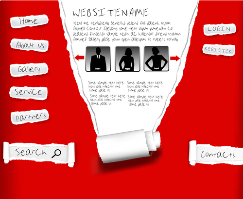 Once you’ve finished planning your website’s content and structural design, you can start working on the first drafts of your different pages. Consider now all of the images and any other elements you want to include on each of your website’s pages.
This only needs to be a rough design to help you visualize what the end results will look like, as well as help you make any necessary changes for each type of buyer persona that will visit a particular page.
Make sure to consider which buyer persona each of your pages are for, so that you can prioritise the elements they are most likely to interact with or be interested in. When the time comes to start designing your website, tell your web designer which elements you want to stand out on a page and what you want your visitors to see first.
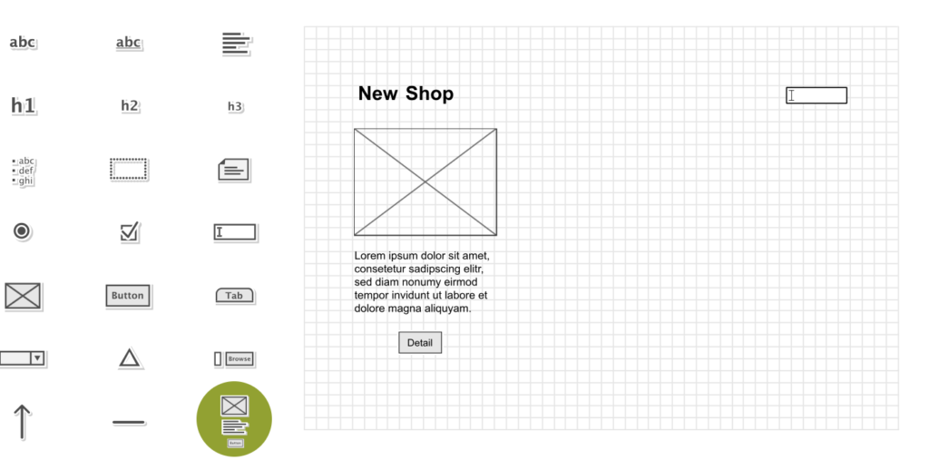
At this stage, I would also recommend you don’t yet incorporate colour in your rough sketch. Colours can distract you or influence your opinions, so by creating your first draft in greyscale, you will be able to better concentrate on the other elements on each page. Just like your website visitors, you will likely be influenced by colours in some way, even without realising it.
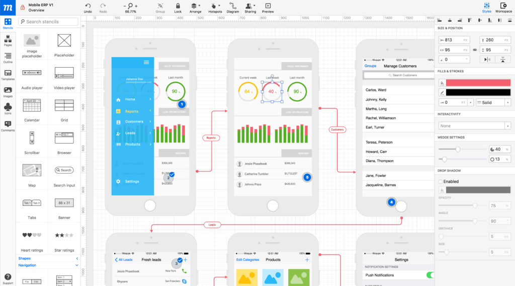
To create your first draft, you can do it yourself easily with a pen and paper, or you can use a tool like Moqups or MockFlow.
[clickToTweet tweet=”How to create the rough #design of your #website via @lilachbullock” quote=”How to create the rough #design of your #website via @lilachbullock”]
How to plan in greyscale
As I mentioned above, planning in greyscale can help you focus your attention on the different elements on your page. Consider:
- How do the different elements on each page relate to each other?
- Hot do their sizes compare?
- Are your most important elements clearly visible and more prominent?
- Are any related elements close to each other? This makes it much easier for the visitor to notice them and go through them
- What shapes do the different elements have? Are there too many different shapes that make your page look messy or are the visitors’ eyes easily drawn to the most important elements? In many cases, varying the shapes of your buttons, banners and so on can help make them more visible to the visitor, but that doesn’t mean that you should make all of them a different shape or size
- What is the alignment of your text like? Is there enough whitespace left, or is the web page too crowded? A crowded page will most likely confuse and even annoy the reader, so in most cases it’s best to make sure there is enough whitespace left on your page
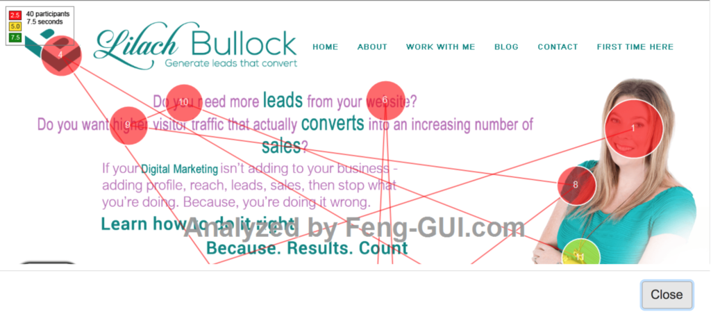
After finishing with your website design, you can use a tool like Feng-gui to help you see if your pages are truly effective and if you need to further optimise your page’s layout. It will also see if the eye-tracking patterns match the way you want them to. If your pages aren’t working the way you wanted them to, you can easily make some layout or content changes to them at this point.
[clickToTweet tweet=”How to plan in greyscale via @lilachbullock #website #design” quote=”How to plan in greyscale via @lilachbullock #website #design”]
Colours
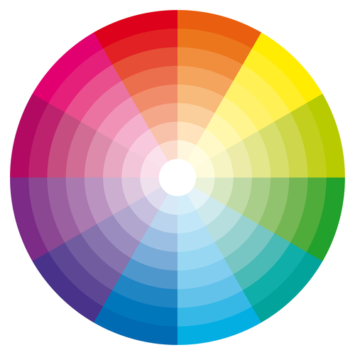 Now that you’ve finished with the first, greyscale draft of your website and your page layouts, it’s time to think of what colours you’re going to use. As I mentioned earlier, colour is very important and can make a huge difference to your success as it has the power to emotionally influence the visitor.
When it comes to colour, you have multiple options. For example, you can use your brand colours exclusively, in order to remain true to your brand identity.
The best way to use colour on a website is to draw your visitors’ attention to the elements you want them to see. If you have a great offer on sale, for example, some bright colour against a duller colour will almost surely, quickly attract the visitors’ eye.
You should also make sure that there is a sharp contrast between any text on your website and the background, be it sales copy or a blog post, so that it’s easy to read. If you have any calls to action on your website, again, it’s best to use a different colour that will attract attention to it and makes sure it’s clearly visible among the other content.
Once you’ve finished your website design, it’s time to test it and see if it truly works the way you want it to. Test it for usability against all different devices and browsers to make sure it works well on all of them, and that your most important elements are clearly visible across board. This is a process that you should keep testing as you go on, even long after your website is launched, as even a small change can make a difference to your overall conversion rate.
[clickToTweet tweet=”How to #design your website so it converts your #traffic into buyers via @lilachbullock ” quote=”How to #design your website so it converts your #traffic into buyers via @lilachbullock “]
Conclusion
Planning and designing your website with conversion optimisation in mind can help you make more conversions in the long run. While you will still need to test your website with different changes to optimise it, it’s still better to start with a great version of your website that attracts conversion. Here are frequently asked questions about small business web design. Do you have a website? If so, how did you plan its design? Where did you start and what were the most important elements you included? Let me know in your comments and please share:)

Follow Lilach


