Follow Lilach
Conversion planning – the 3 main steps to increasing your conversion rate
Do you want to increase your website’s conversion rate? Is your website, or your landing page failing to persuade your visitors to buy? Conversion rate optimisation, or CRO in short, can help you achieve better results for your website and improve your conversion numbers without having to pay for more advertising.
In this blog post, we will be looking at the most important elements of conversion planning, so that you can create a better, more successful website.
Conversion planning – the 3 main steps to increasing your conversion rate
Understanding the conversion formula
Before we can dive deeper into the steps necessary to help you increase your conversions, it’s important to understand the conversion formula; i.e. what exactly is it that makes the difference between converting and not converting? What is it that makes the visitor from a simple browser into a buyer?
 It’s close to impossible to respond to that question – in fact, every website is different and what works for one website can be irrelevant or even damaging to another website. Not only that, but specialists have found that there are more than 1000 variables that can have an impact on your conversion rate – way too many to be able to successfully cover them all.
The issue is, that some of these 1000 variables won’t make much of a difference to your conversion rate. The difference could be hardly noticeable, or it could that it is so small, it’s not worth your time and resources to focus on it.
Like many other areas in business, you need to find a balance. There will never be enough time or money to explore all the different avenues, so it’s important to strike a balance, and in this case, focus on the areas which will have the most impact on your conversion rate, ultimately.
[clickToTweet tweet=”Understanding the #conversion formula via @lilachbullock” quote=”Understanding the #conversion formula via @lilachbullock”]
The three key areas of Conversion Rate Optimization: Relevance, Value and Call to Action
So, your website isn’t converting at the rate you want it to… the reason for that, thankfully doesn’t matter. It could be your adverts are not that great or your landing page is difficult to read, but whatever it is, the answer is the same: applying a simple three step approach throughout your marketing process.
It’s a very simple formula, based on three questions. They key to this formula is to get you to think like your website visitors and find the answers to the three main questions that a website visitor will ask:
- Is the answer provided relevant to my query? The website browser is looking for an answer that is relevant to the query they made as they started their search. This doesn’t mean necessarily that they are actively searching for a question on Google, for example; but rather, they have a problem and they’re looking for an answer to it – which has led them to your specific landing page or another page. It’s up to you to identify what that problem is and then show them that you are relevant to their specific need.
- Why are you the right solution for me? The thing about solution is, that there is usually more than one; and when it comes to websites and online businesses, it is quite likely that there are quite a few other solutions available out there, from your competitors. You need to show that somehow, your solution to their problem is the best out there and give them a good reason to trust them over others.
- What do I do now? This is basically the call to action. Your website visitors have found the answer they were looking for, found it to be the best solution for them, and now they need a reason to take action. It’s important here to differentiate yourself from your competitors, remove all possible obstacles that stand in the way of making a conversion and give your visitors a compelling reason to take action.
[clickToTweet tweet=”The 3 principles of #conversion rate optimisation via @lilachbullock #CRO” quote=”The 3 principles of #conversion rate optimisation via @lilachbullock #CRO”]
These three principles are not just for conversion rate optimisation; in fact, they are also mentioned in the guidelines for Google Adwords, evidencing what Google thinks of as quality content as well as relevant and original content.
The importance of relevance
As I mentioned earlier, it’s very important to provide the answers that are relevant to your audience and website visitors.
Not only that, but they also need to be able to easily find what your advert or website is promising them, within seconds of accessing your web page.
You can’t make your readers work to find out what you can do for them – they can just go directly to your competitors and find that information much quicker.
Here are some of the most important things to remember:
- Link directly from your advert, post or update to the relevant page on your website
- Make sure any web search or link you post leads people to the most relevant page on your website – it can be products or services, or it can be blog posts, but whatever it is they’re looking for, the website page they see should be relevant
- Choose a page that provides the most useful information about the product or service that you are talking about or advertising. For example, if you sell multiple products on your website but your ad is only for one of the products, ideally you should direct people directly to where they can buy that product as quickly as possible, rather than a page where it’s bundled with other products or your home page, for example. Most visitors will likely give up if they can’t find the product they’re looking for as soon as possible, and move on to one of your competitors.
[clickToTweet tweet=”The importance of relevance for #conversion rate optimisation via @lilachbullock #CRO” quote=”The importance of relevance for #conversion rate optimisation via @lilachbullock #CRO”]
It’s not just advertising where relevance is so important, but also for Google’s search ranking. Relevance plays a huge part in their search engine’s results, but also in the way website visitors look for answers to their own queries.
Another important set of questions to ask yourself is:
- What is your value to the reader?
- Why should they choose your solution to their problem?
- Are you a trustworthy website to buy from?
You will need to try to think as a website visitor rather than a business owner in order to find out the answers to these questions.
You should also consider that when someone visits your website, they might not know anything about your business. In this case, it’s very important to establish value, or as Google calls it, Transparency, that will essentially help you build trust with your website visitors.
In order to start building trust with your website visitors, your website will have to be very clear with the following three primary areas:
- What the nature of your business is
- How your website interacts with a visitors’ computer and
- How you intend to use a visitors’ personal information
You will also need to keep in mind the importance of:
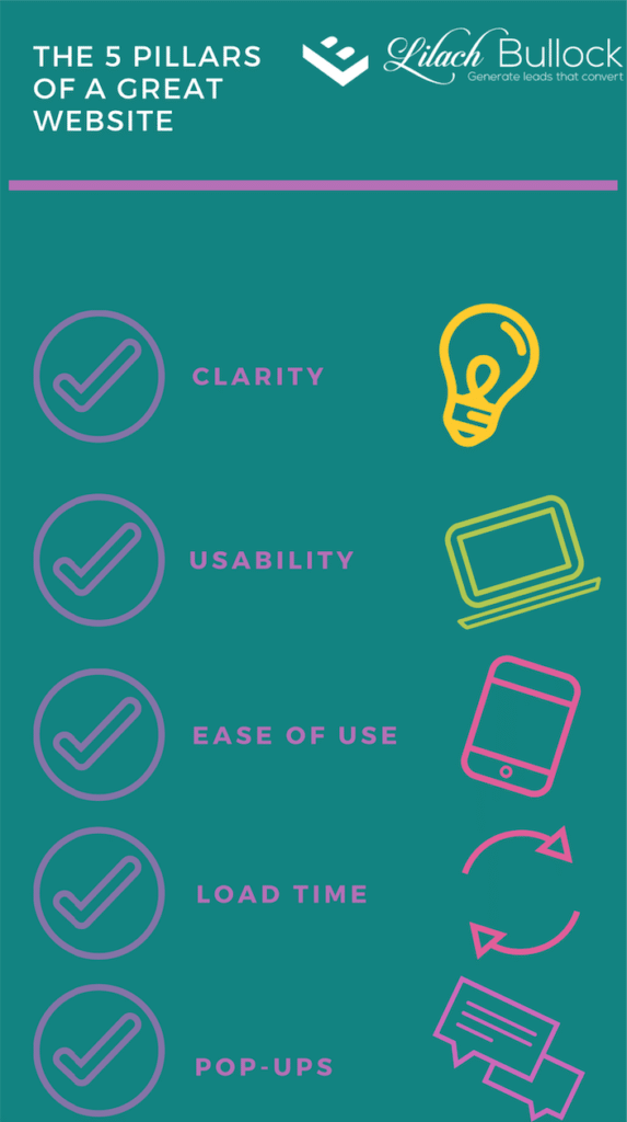 Clarity: You need to make sure that your website or landing page is as clear as possible to your website visitors and that they know exactly what you can do for them. If there is any doubt or confusion, then you’re not really proving your value to the visitor – and this might mean they will go somewhere else to solve their problem.
- Usability: It’s also very important to make sure your visitors are very clear on how to use your website, intuitively. Otherwise, it doesn’t even matter how great your content is if your visitors don’t know how to find that information or access it. Your website has to be organized in such a way that your visitor will intuitively know what to do in order to find the information they are looking for, on any device they might be using, desktop or mobile.
- Ease of use: One of the most effective ways of turning your visitors into customers is to make it as easy as possible for them to find whatever it is they are looking for. If you have an advert for a product, make sure your visitors have a short and easy path to follow in order to purchase or receive whatever that product is. Rather than have them have to search for the next step they would need to take, try to provide them with everything they need, as well as guide them through your website stage by stage. As an example, I am a big online shopper, especially when it comes to buying groceries. So I’ve tested most of the big brands to find the perfect one for me – Sainsbury’s, Tesco’s, Ocado and Asda. By the end of my research, I found I preferred Sainsbury’s and Ocado; well, I actually preferred Sainsbury’s as it was cheaper. That said, the online experience on the Sainsbury’s website wasn’t nearly as good as Ocado, which in the end, meant I settled on Ocado. If you’re an online shopper, I’m sure you probably have some similar experiences. It goes to show how important ease of use and a good online customer experience are and how they came back the difference between you and the competition.
[clickToTweet tweet=”The 5 pillars of a great website via @lilachbullock #CRO” quote=”The 5 pillars of a great website via @lilachbullock #CRO”]
- Load time: the modern website user doesn’t have the time or the patience to wait for excessive loading times; there’s likely to be a better, faster website just a click away, so there’s no need for them to lose time on a slow website. In order to properly test your website though, you need to test it on all kinds of different devices, as well as test each individual page. For example, if one of your landing pages has some complicated design, it can take a lot longer for that page to load – you need to think about what is more important, short wait time or a complex design?
- Pop-ups: Pop-ups and other similar marketing devices can be very effective in improving your conversion rates. That said, it’s very important to find a balance and know when there are too many pop-ups on your website or they’re getting to be annoying. If your pop-ups start getting annoying, visitors might leave your website, or even worse, remember it as a very irritating experience and never come back to it.
The three-point evaluation system
To sum it all up, in order to start your conversion planning you need to examine every aspect of your marketing in light of these three criteria:
- Relevance
- Value
- Call-to-action
[clickToTweet tweet=”The 3 point evaluation system for conversion optimisation via @lilachbullock #CRO” quote=”The 3 point evaluation system for conversion optimisation via @lilachbullock #CRO”]
While these concepts can seem quite simple and straightforward even, applying them can make a huge difference to your website and get you much better results, through an increased conversion rate.
Just take a look at some of the best, most successful websites on the Internet and see how they are able to make the decision to buy much easier for their customers by:
- Pointing out why they are the right choice for their visitors
- Building trust by including testimonials or reviews of their products
- Adding enough product information to answer any possible questions that might stop a visitor from making a decision
- Adding a clear call-to-action displayed on their landing page
Conclusion
If you want more useful tips on how to increase your conversions, check out these conversion tips from 40 experts.
How well are your website pages performing? Are you getting the results you’re looking for? How are you optimising your website and landing pages for more sales? Let me know – and please share 🙂

Follow Lilach


