Follow Lilach
Building a website that drives revenue not just traffic
How are you going to persuade those who visit your website to buy from you? Visiting your website isn’t enough. It is only those who buy from you who generate revenue for your business, and in many cases that can be as low as 2-3% of those who visit your website. With more that 95% of your website visitors failing to convert how can you change your message and push your conversion rate higher? In this post, I will show you how to create a website that turns visitors into buyers.
If your website has traffic but isn’t producing the sales you want the most likely reason is that you have a problem with either the copy on your website, or with the design of your website. Let’s look at the website copy first.
 Website copy has to appeal to the reader. It must answer to some felt need in their life. “What’s in it for me?” This is the question that your readers are asking time after time. What your customer wants to know is how will your product make their lives better. Surprisingly, there are still a lot of businesses that haven’t grasped this principle. There are plenty of corporate websites around where the focus of the page is entirely on the company. They tell their readers how professional and efficient they are. They list all the awards they have won, but they never explain to the reader what they can do for them. This is a huge mistake. Your customers don’t care about your business; they want to know how your business can improve their lives.
If you want to improve your website copy start with the headline. This is the most critical part of your page as it’s the first thing that most of your readers will see when they arrive on your page.
Your headline must tell your reader what the page is about, and do it in a way that makes them want to read more. Even when you think you have a great headline it is still possible to improve it. Testing your headlines is critical so that you know whether your headline is drawing people to read more or driving them away from your website.
[clickToTweet tweet=”Building a #website that drives revenue not just #traffic via @lilachbullock” quote=”Building a #website that drives revenue not just #traffic via @lilachbullock”]
The secret to great content
 What is the secret to producing content that attracts readers and goes viral every time you post? One company that has been able to enjoy success doing this week after week is Upworthy, and they have produced a presentation explaining exactly how they do it.
They follow the same five-step process every time they create content
- Find great content
- Format it for Facebook
- Promote it on Facebook
- Test it
- Profit from it
[clickToTweet tweet=”Building a #website that drives revenue not just #traffic via @lilachbullock” quote=”Building a #website that drives revenue not just #traffic via @lilachbullock”]
The first priority has to be to find or write great content. You can spend money on PPC or Facebook advertising but if your message doesn’t engage the reader then you aren’t going to see conversions.
Upworthy work with Facebook to promote their content and encourage the sharing of their content on social media. If you are writing blog content then this is a great strategy to reach a large audience. If your content is more sales based then you may want to promote it in other ways. Whatever you do make sure that your content is as good as it can be, and is properly framed for your audience before you start to promote it.
Try to simplify your message as much as you can using simple, easy to understand language and avoiding jargon wherever possible. Write short paragraphs and let people see exactly what’s going on at each stage of your page.
Make use of bullet points, and break up the text with images that give your readers eyes a rest from text for a while. Above all, remember your customers are not interested in your business. They are interested in what you can do for them. It is this, your unique value proposition that should be prominently displayed on your website where readers can’t miss it.
Check your web copy again
Sometimes you work hard to create content that you think looks great, but it doesn’t produce the results you were hoping for. When this happens, take another look at your copy and ask yourself some questions;
Is your message clear?
Is your message valuable?
Does your audience trust you?
Have you answered your readers’ main objections?
Do your readers know what it will it feel like after they buy your product?
Have you backed up any claims you make for your product?
Have you made the next step clear?
If you can honestly answer yes to all of these questions then maybe it isn’t your copy that’s the problem. It could be that there is something else wrong with the way your website is laid out.
[clickToTweet tweet=”Building a #website that drives revenue not just #traffic via @lilachbullock” quote=”Building a #website that drives revenue not just #traffic via @lilachbullock”]
Laying out your website for conversions
 One of the biggest mistakes that people make with landing pages is to start with their chosen design and add the website copy later. This is the wrong way around. If you complete the design first you are forced to edit your copy to fit the available space in the design. You may not be able to say everything that you need to, or you may find that the chosen design doesn’t match the content, that the graphics are the wrong shape or in the wrong place. If you want a website that converts you must design the whole website with conversions in mind from the very beginning.
Work on your website copy first and when that is ready send it to the website designer so that they can create a design that complements the copy. In this way the designer will have a better idea of the focus of the page, the amount of space that they have to work with, and the prominence they should give to every section.
When you start work on a new landing page start by asking “what is the emphasis of this page?” Every web page you create must have a particular focus or emphasis. To achieve the desired goal of the page some elements of the page are going to be more important, and therefore more prominent than others.
For example, if you are designing a product page on an e-commerce website you will want the buy button to be prominent so that your visitors know exactly how to get the product, once you have convinced them that they need it. If your website is information based rather than a sales website your priorities will be different. Maybe you will want a download link, or a sign-up form for your newsletter to be prominent instead.
Sit down and write a list. Work out which elements of the page are most important to you. These are the ones you want to emphasise, and the ones that should stand out and be obvious in your finished design.
It can be tempting to start a website design by thinking about the colours you will use, but that isn’t the most helpful way to approach it. It is helpful to look at your chosen design in greyscale rather than colour in the first instance. Colour can have a big impact on the way we view things and a poor colour choice can often turn us off a great design, or a good colour choice could cause us to choose a poor deign even though many aspects of the design could be greatly improved.
By starting with a greyscale design you are able to carefully examine the shape and the scale of each element of your page layout without the distraction of colour. This offers the opportunity to look at the shape of each element, and how they relate together on the page.
[clickToTweet tweet=”Building a #website that drives revenue not just #traffic via @lilachbullock” quote=”Building a #website that drives revenue not just #traffic via @lilachbullock”]
Which elements of your design stand out at first glance? Does the page look better left justified or centre justified? That can impact the way people feel about the page on a subconscious level. They may know something is not quite right even if they cannot put into words exactly what the problem is.
Sometimes conversion optimisation can involve something as simple as changing the shape of a button. Amazon.com put a lot of thought into their ‘add to cart’ button. A quick glance could suggest that the button is a standard shape, but in fact it has been tested and proven to be the optimum shape to generate click-throughs and conversions, and as a result has been widely copied across the Internet.
Consider the elements of your own page design. Does anything look out-of-place? Perhaps too big or too small? Are all the elements in logical places? You don’t want your visitors to have to jump around your page looking for the link to the checkout or the next thing they need to do. Place your buy button close to the Call-to-Action so as soon as the reader is stirred into action they have the button clearly visible, ready for them to click before they can get distracted or change their mind.
Next, look at the white space around your page. Does it feel right? Not too crowded? Not too minimalist?
If your website does not engage with visitors within a very short space of time they generally leave and look elsewhere to find what they need. It is essential that your website is designed so that the most important elements, those you want to emphasise, are what draws your readers attention within the first five seconds of their arrival on your website.
Once you are happy that all of the elements of your design have been properly arranged, and look right greyscale it is time to add some colour to the picture.
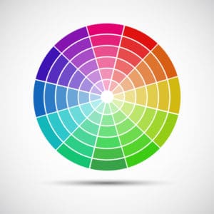 Colour is an effective way to emphasise one element of the page over another. Think about contrasts. Take the elements that you view as being the most important and use striking colour contrasts to make them jump out and hold the readers’ attention. Colour isn’t just great to draw contrasts between elements. It can be used to create families or hierarchies on your page. Your visitors shouldn’t have to guess which sections of the page belong together. By highlighting them with groups of colour you can make it obvious which parts of the page they should focus their attention on.
Visitors will get most of the information they need from the words on your page but pictures should not be overlooked. They can be useful to break up the content into more manageable sections but they are also there to serve a purpose and not just to look pretty. Faces in particular can be effective marketing tools if used well, but very distracting if you get it wrong. People connect with people more than with logos and graphics so adding a human face isn’t a bad idea, but where is the focus of the picture, what does it make the reader do? Look at the eyes of the person in the picture and follow them to see where they lead. Your readers gaze is likely to follow the gaze of the person pictured so try to get the person in the picture looking at the text which matters. Let them direct the visitor on to the next section you want them to read.
Go through every element on your page and ensure that it has the right level of visibility, that it is grouped together with the right elements. When you have finished it is time to test the page again. Find some test subjects who are unconnected with your business and ask them to look at your page for a few seconds and then to write down what your top priorities are. If they can consistently get those priorities right then your design is working the way it should. If they regularly get your priorities wrong then you know that you have some work to do to present your business more effectively.
[clickToTweet tweet=”Building a #website that drives revenue not just #traffic via @lilachbullock” quote=”Building a #website that drives revenue not just #traffic via @lilachbullock”]
Check for compatibility
Another area that often gets overlooked by businesses is website compatibility. Creating a great design that converts traffic is vital, but if part of your audience can’t see it then you are losing potential sales.
You should test your website for compatibility across a range of operating platforms and mobile devices. Make sure that every element displays properly, check that nothing is too small to see properly and that the mobile site navigation makes sense. Do everything you can to maximise your audience, and not cut off a segment of them because they can’t access your website.
Test your design
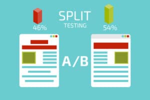 Now you have a website where each element has been checked to maximise conversions it is time to open it up to the real-world and see how it performs. This is where the website testing really begins.
A/B testing lets you take two versions of your landing page, or any other page on your website and see which performs the best.
There are plenty of tools online that can help you with A/B testing. https://goo.gl/ is a great place to start, but others are available. Take your page and create two versions of it with one change between then. You might try a different headline, or a different graphic, or perhaps a different free offer. Make sure you only make one change at a time or you won’t know which change influenced the different responses to the article.
Now try to find two locations with comparable demographics and populations among your followers. You can use https://goo.gl/ to supply different URLs to each area. Monitor the response you get for the next ten or twenty minutes and see which version of the page produces the greatest response. Once you have determined which version has the best performance you can switch permanently to that version of the page.
Conducting tests like this on every page will help you to achieve maxim benefit from your copy. Conversion optimisation is an ongoing process so keep refining your website and you will build a website that continues to convert better and better as time passes.
Has this post been helpful to you? What great advice did I miss? Let me know in the comment section. Don’t forget to share this content with others so they can benefit as well.

Follow Lilach


