

Follow Lilach
5 Tiny Content Tweaks for Big Conversion Boosts
The goal of content marketing shouldn’t be just to write: it should be to WRITE RIGHT. When I was learning how to write, my mentor told me that if there aren’t many cross-outs, I’m not doing it right. In other words, there’s no way that you (or I) can get out the perfect message on the first go round. It’s just not possible. That was back in the days before computers were commonplace, where every word had to be written and rewritten by hand. But that’s a story for another time.
Unfortunately, in today’s busy times, many content markets are solely focused on crossing tasks off their to-do lists, and less about what their output will mean or how it will perform. Fortunately, copywriting isn’t like submitting a college paper. You can – and SHOULD – test out multiple options to see which works better. We don’t have to trash early versions of our writing anymore. We can use them to see what our readers respond to, and use early drafts to improve both our performance and productivity.
According to internet marketing ninja Neil Patel, “writing great content is a choice.” You can choose to put in the time and work required to create great content, or you can choose to take the easier path, throw some words on a webpage, and call it a day. Which of those writers do you want to be?
Before get started, think about the challenges that you face when writing content:
- Are the demands from your SEO team too burdensome? (Do they want an unreasonably high word count or ask you to weave in irrelevant, unattainable keywords?)
- Do you fully understand your company’s product? Perhaps it’s a software that you’re not entirely familiar with or it has intricacies that you don’t fully grasp?
- Do users understand your product, or do they need to be educated? Maybe you’re assuming they already know about you or your industry when they really don’t?
- Have been in your job for so long that you’ve got writer’s block? Or you’re just bored of sharing the same message over and over and over?
All of these struggles are real, and it’s worth taking a minute to see which one (or ones) of these are plaguing your writing and preventing you from being your best professional self.
In the rest of this article we’ll cover some ways in which you can write smarter, not harder. We’ll look at some case studies about when more words work, when less words work, and when changing even a single word or image can make all the difference in the world. Hopefully you’ll get inspired by the possibility that small tweaks can make a HUGE difference in the performance of your writing.
Once we’re done looking at the case studies, we’ll review some practical tips that can make copywriting more efficient, less frustrating, and even more fun.
Let’s start with some test cases.
Case Study #1: Adpresso’s Facebook ad
Adspresso, Hootsuite’s product that helps marketers create and manage their social media ads in one place, wanted to increase the number of likes on their Facebook page. They ran two Facebook ads to see which one would result in a higher number of likes.
The first ad said:
Do You Run Facebook Ads? LIKE us for pro tips on how to improve your Facebook ad campaigns today.
The second ad said:
Do You Run Facebook Ads?
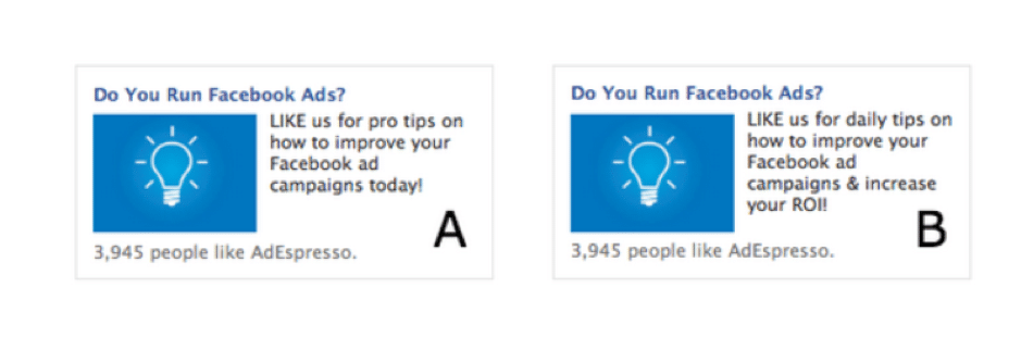
LIKE us for daily tips on how to improve your Facebook ad campaign & increase your ROI!
At first glance, these texts are extremely similar, and one might expect performance to be similar. But that’s not at all what happened! The result was that Version A, “LIKE us for pro tips on how to improve your Facebook ad campaigns today!” resulted in 70 Facebook likes. Version B didn’t even get 1 like.
What can we learn from this? From the first line you can see why Version B did so poorly (not even getting 1 like.) People don’t like being spammed. Telling them that they’ll be getting a daily tip is basically warning them that they’ll have to sift through emails to find useful information. Changing the text from DAILY tips to PRO tips may have been what actually tipped the scale from failure to success.
A similar theory can be proven when writing PPC ads. PPC ads are a case in which literally every word matters. It’s also a realm in which writers tend to experience severe burnout, since they’re often writing dozens or hundreds of ads monthly, usually about the same topics. With these ads, no matter what medium you’re using – Google, Facebook, Bing, etc, there’s limited real estate and lots of message that you want to get across. There’s no question that writing PPC ads requires both art and science. It also requires lots and lots and lots of testing. This is a prime example of when you’ll want to see all of those cross-outs. Try different things. You may be surprised at what you find.
One relevant case study comes from WordStream, an online advertising agency. They write about how they tested 2 PPC ads:
The first one said: Get $10 off the first purchase. Book online now!
The second one said: Get an additional $10 off. Book online now.
The CTR doubled with the second option. Even though I have more than 15 years of copywriting experience, I’d have bet on the first option. So did the pros at WordStream. It just goes to show you that the only way to know for sure is to test, and take a hard look at the data. It may even require eating a bit of humble pie when your option doesn’t get the best results. But, to be honest, I find that to be a great way to learn, grow, and get out of your comfort zone.
Case Study #2: Humana’s Banner Ad
Do you find it hard to believe that a few small text tweaks can make a big difference? It’s often a hard pill to swallow, and it’s hard to think creatively sometimes, and to say the same thing in multiple ways. But let’s look at another case study, this time one that highlights the theory LESS IS MORE. This is also a difficult theory to accept these days, when we’re so used to wordy diatribes and articles that are stuffed with words because SEO advisors believe that having more words means having more results. Fortunately, when it comes to ad copy, search engines don’t care how many words you have – and potential customers don’t either. Let’s take a closer look:
Humana, a Kentucky-based insurance carrier, created a fairly straightforward A/B test with huge results. The company had a banner with a simple headline and CTA as well as an image. Through A/B testing, the company realized that it needed to change a couple of things to make the banner more effective. This is the second of two A/B testing examples that reveals one test just isn’t enough. Nevertheless, for this specific example, we’ll be looking only at the second test.
The goal
According to Design For Founders, Humana wanted to increase its click-through rate on the above-described banner. The original design was attractive, but the company suspected it could improve CTR by making simple changes.
They were right.
Let’s look at both banners:
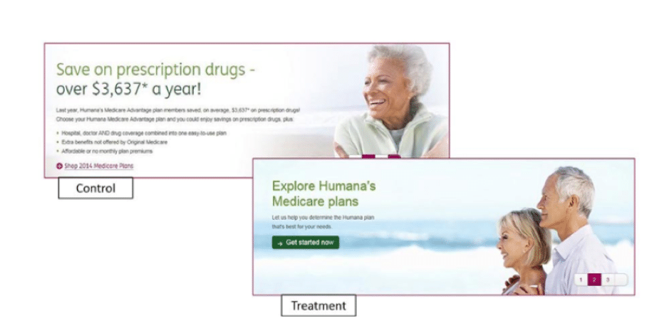
The initial banner had a lot of text. On one hand, this is great, because it gives readers SO much information. On the other hand, too much text can be overwhelming, and you can lose your readers’ attention span. The first ad had a number in the headline, which often leads to better conversions, and a couple lines with a bulleted list. That’s pretty standard, but it wasn’t giving Humana the results they wanted.
The second variation reduced the copy significantly. Additionally, the CTA changed from “Shop Medicare Plans” to “Get Started Now.” A couple of other changes, including the image and color scheme, rounded out the differences between the control and eventual winner.
Result
Simply cleaning up the ad copy and changing the picture led to a 433 percent increase in CTR. After changing the CTA text, the company experienced a further 192 percent boost.
This is another example of incredible results from a fairly simple test. Humana wanted to increase CTR and did so admirably by slimming down the copy and changing a few aesthetic details.
Why it works
Simplicity often rules when it comes to marketing. When you own a business, you want to talk about all its amazing features, benefits, and other qualities, but that’s not what consumers want.
They’re looking for the path of least resistance. This A/B testing example proves that people often respond to slimmed-down copy and more straightforward CTAs.
From these two case studies, we can learn two things:
1 – word choice matters
2 – less can be more
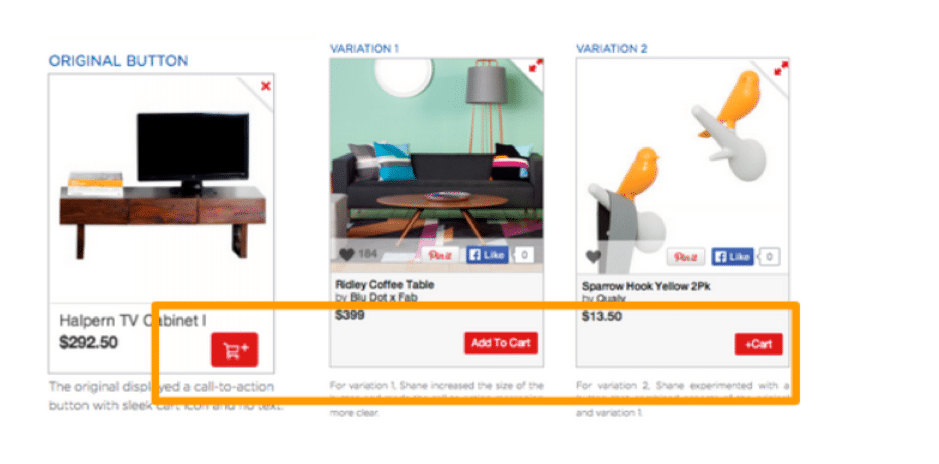
But there are also cases when MORE words elicit more action. A prime example is the case of Fab, an online retail company whose members can buy and sell apparel, home goods, accessories, collectibles, and more. The platform’s original design features an add to cart button that was a picture of a shopping cart. The company wanted to test whether they could increase the adds to cart by changing the button. They tried two different designs: a button that said “Add to Cart” and a button that said “+ Cart”.
Take a look at the three designs:
Result
Spelling out “Add To Cart” increased cart adds by 49% over the original graphic design.
The original design (on the far left) features a small shopping cart with a “+” sign and no text. The two versions (middle and right) added text based designs. Version A “Add To Cart” was the winner and helped increase cart adds by 49% over the original.
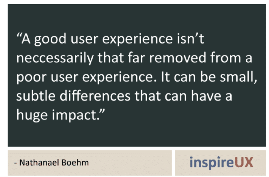
According to Nathanael Boehm of inspireUX, “A good user experience isn’t necessarily that far removed from a poor user experience. It can be small, subtle difference that can have a huge impact.”
According to the Econsultancy User Experience Survey Report, more than 95 percent of the respondents agreed that a good user experience ‘just makes sense’. It sounds obvious, because what website visitor WOULDN’T want a good user experience? But from our side, as marketers, it means we’ve got to work a bit to get the user experience just right. And, as we can see from the case study of Fab, it sometimes just takes a bit of a clear, textual direction to your users to get the desired results.
A final thing to consider is how changing your forms can increase your lead generation efforts. There are literally hundreds, if not thousands of statistics and case studies about how optimizing your form can bring in more leads and better qualified leads. For example, a Salesforce study concluded that companies that excel at lead nurturing generate 50 percent more sales-ready leads at 33 percent lower cost. Sounds great, no? But how can you actually do it?
There are some general tips that can help improve your form performance – and then you have to just TEST, TEST, TEST. For starters, make sure that your form (or, at the very least, your CTA) is above the fold. You’ll get significantly more engagement by saving your readers from scrolling. In fact, some studies suggest that users engage up to 84% more with text that is above the fold.
Secondly, use a strongly-worded button that will tell your readers EXACTLY what you want them to do. This goes back to the whole “submit” issue. Check out this example from videofruit.com:
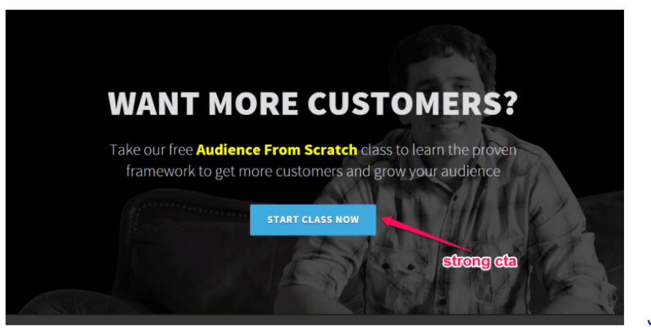
They could have used any old CTA – start now, get started, begin now, let’s go….but they gave very specific instructions, and it worked.
Third – make sure that your privacy statement is easily viewable. Even if it’s a slew of legal mumbo-jumbo, it’s important to gain trust these days, especially when email spam seems to be gaining popularity. Let your leads know that you value their privacy and just want the best for them.
Fourth – Try to use as few fields as possible. Neil Patel did a case study and saw that his form got 26 percent more registrations just by removing one field from his form. Dan Zarrella at HubSpot found a similar phenomenon – in his research of the contact forms of 40,000 HubSpot customers, he found that conversion rates increased by almost half when the number of form fields are reduced (from 4 to 3).
So, while it’s always nice to get as much information from your leads as you can, consider what information is truly necessary and what you can live without – it may mean the difference between capturing the lead or ending up empty handed.
Lastly, make sure that your form isn’t surrounded by other distracting information or images. In many cases, it’s not the form that’s performing badly, it’s the rest of the text that prevents users from completing the form because they’ve gotten distracted.
Let’s look at some great forms to help you get the creative juices flowing:
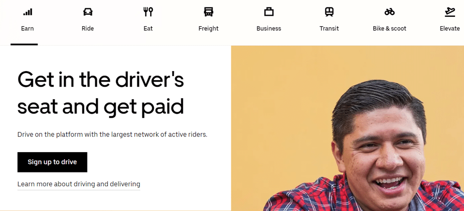
1 – This is Uber’s current form. Notice the call to action is MAKE MONEY. They’re clearly telling people what they want to hear, especially in today’s depressed economy. And there’s a single button with a clear action item with no distracting text anywhere near the form.
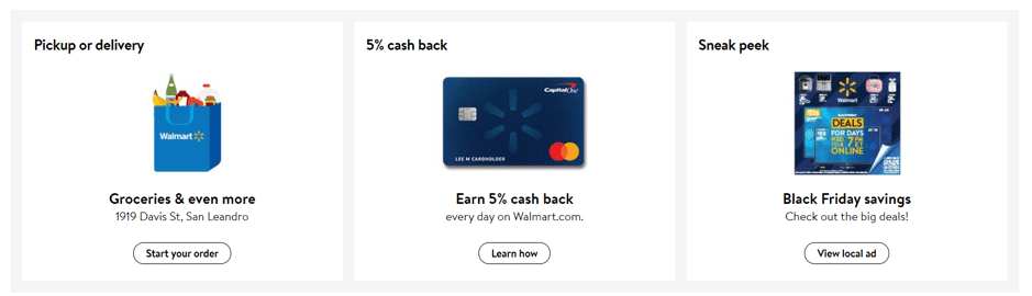
2 – Walmart uses three different call to action buttons to get its message across extremely clearly. Again, the surrounding text is extremely short and to the point. This is a perfect example of the less is more strategy, both for forms and for general text.
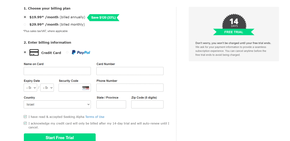
3 – Here’s an example of a form from Seeking Alpha that is probably less successful. The call to action clearly offers a FREE TRIAL, but the user is required to provide credit card information in order to get the FREE trial. The message may be a good one, but the action item conflicts with the message and isn’t likely to convert well.
SO….NOW WHAT?
We’ve clearly established that testing is important, and will help you figure out (1) what your audience wants to hear and (2) what trigger words will make them take action. We’ve concluded that being short and to the point can help get your point across without distraction. We’ve established that the difference of one (or two) words can have a significant impact on your performance rate.
But how do you know where to get started?
Let’s start by looking at our ‘negative space’. We may not know from the get-go what words will elicit the response we want, but there have been studies done about what words we DON’T want. Some words that will almost surely elicit a negative response (or a lower-than-desired response):
Submit – This sounds like an obvious word to use when you want users to fill in your form, and, well….SUBMIT it. But marketers across the globe will tell you that the word SUBMIT is a less-than-ideal choice for your form CTA button. Why? Well, according to Olliver Roddy from Green Room Design, the word Submit is just plain boring. He likens it to the cliched ‘click here’ or ‘subscribe’ buttons from the early days of the internet.
But, if you ask Brad Smith from WordStream, he’ll tell you that the word Submit gives a not-so-subtle hint towards domination, giving your website visitors the idea that you’re trying to control them, or, make them Submit to you. Whether you want to avoid being boring or dominating, you may want to avoid using the word Submit altogether.
Another word to avoid when writing marketing copy is WE. This short word is extremely popular because it often makes readers feel like you’re with them. But to be honest, you’re not really WITH your customers. You’re FOR them. You’re supposed to be serving them, perhaps knowing more than they do about your area of expertise. When you use the word WE to identify intimately with your customers, you undo your distinction and erode a bit of what makes you special. Alternatively, if you use the word WE to show what you offer – for example, saying WE are the best, WE work hard to…you’re making your message all about YOU, and not about your customers. It’s a subtle mental switch, but removing the word WE from your marketing vocabulary can actually lead to stronger results.
Another trap to avoid when writing web copy is to skip highfalutin language (see what I did there?). In other words, KISS – keep it simple, stupid. There’s a famous episode of “Friends”, when Joey tries to write a ‘sophisticated’ letter of recommendation. He wanted to say: “They’re warm, nice people, with good hearts.” He actually wrote: They’re humid, prepossessing, homo-sapiens, with full-sized aortic pumps.’ See what I mean? Oftentimes when you use high-level language in an effort to make yourself look good, you lose your audience. After all, they just want you to get to the point.
If you’re not sure whether your text truly speaks to your audience, think about this hint from Dharmesh Shah, the co-founder and CTO of HubSpot:
“Many companies have forgotten they sell to actual people. Humans care about the entire experience, not just the marketing or sales or service. To really win in the modern age, you must solve for humans.”
Try to really, truly think about the question that your company solves. Why should people want to use your product or service? What type of experience do you want them to have on your website? With your product? If you can honestly answer these questions, your writing should flow much more easily.
So…what words SHOULD you use?
You’re probably waiting for a list of really juicy words that will get your readers to do what you want. And I wish I could give that to you. But the truth is, there are no global ‘power words’. There are just words that have proven to work well for YOU. That being said, there are some words that do tend to garner more interest than others. These include words like HILARIOUS, FREE, GENIUS, and EMBARRASSING. But of course, these might not be relevant in your field, so you shouldn’t just go and use them just because they’re known to elicit action and emotional responses. Use them wisely – and more importantly, go out and test different words in your industry, and see what works.
The truth is, studies show that 80% of readers will read your headlines, but only 20% of people will read the rest of the content. So, let’s apply the 80-20 rule here – even if the text takes up 80% (or more!) of the word count, you should allocate only 20% of your resources there, and put 80% of your energy into the title. Because that’s what will really count.
So, let’s recap:
- Content marketing can be tedious or frustrating, even for the most creative and successful writers. The trick is to continually stretch the boundaries of your creativity and not be afraid to try new things (incidentally, this is a great tip for life, not just for content writing).
- Even if you’re not on the design team, don’t be afraid to look at the bigger picture. Consider how your writing will play into the design of the page. Where will the form be, and what action do you want people to take on it?
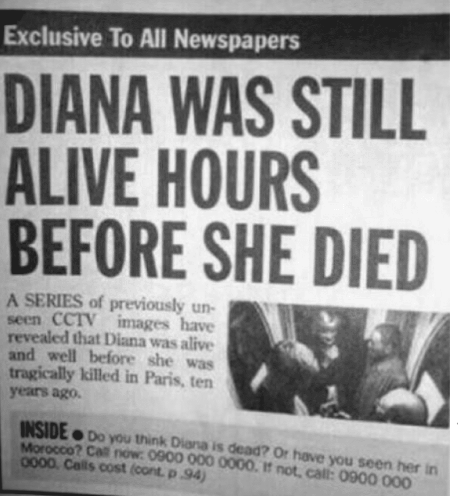
- Think about your headlines. They matter. If you ever need a bit of a laugh to break up your day, take a look at headline flops – it’ll clear your head and remind you to stay focused on your message. Here are two of my favorites:
I’d like to end with a quote from Joe Pulizzi, the founder of the Content Marketing Institute:
“Content marketing comes down to commitment. There’s no halfway. You’re either in or you’re out.”
I hope that you’ve gotten some ideas and inspiration here to go “all in” on your content writing. As a long-time content marketer, I can tell you that there’s so much personal satisfaction in knowing your work has helped businesses grow and customers find the products they need to help improve their lives. I really look forward to hearing about your successes!
Follow Lilach